Courses App
iPhone app for course discovery
Courses is an app that helps students discover courses offered by the iSchool at the Univeristy of Washington, Seattle. This is a passion project I created to solve an itch that I had when looking for courses.
The Problem
Before starting school at UW, I had to select Interdisciplinary and Management courses that I intended to take in the first quarter. I found the entire process of viewing courses from the school website, reading descriptions, noting down and counting the total credits very painstaking. This was mainly because I had to constantly switch between two very bland web pages and note down information such as number of credits, course names, etc. When I wanted to access the site through a mobile device, I had to zoom in just to read course descriptions. I wanted an easy way to access my courses, number of credits and descriptions, so I decided to build an app for myself.
TYPE :
An independent development and design project
MY ROLE :
I worked independeintly on designing and developing this app for helping me be more productive.
METHODS USED :
Research, Wireframes, iOS Development
TIMELINE:
September 2014 - October 2014
The Objective
To design and build an app that lets a student (the intended user) easily manage and access iSchool course numbers, descriptions and number of credits.
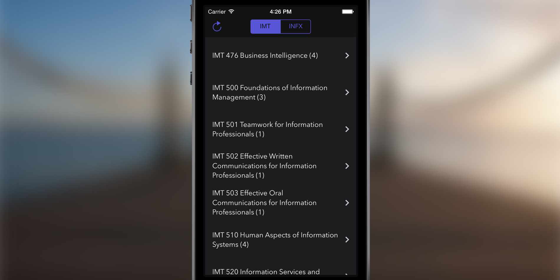
Current Course Website
Currently, students have to continuously switch between different web pages just to view different courses that are available. Details provided in the app are not always adequate. Students also maintain a separate sheet with previous courses they've taken and the number of credits they've used up.
As can be seen in the image to the side, the website is just a plain list of Information Management & Technology (IMT) courses with no way to switch to the Information School Interdisciplinary (INFX) course type or mark courses as favourites.
Sketches
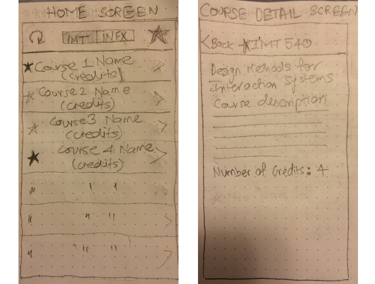
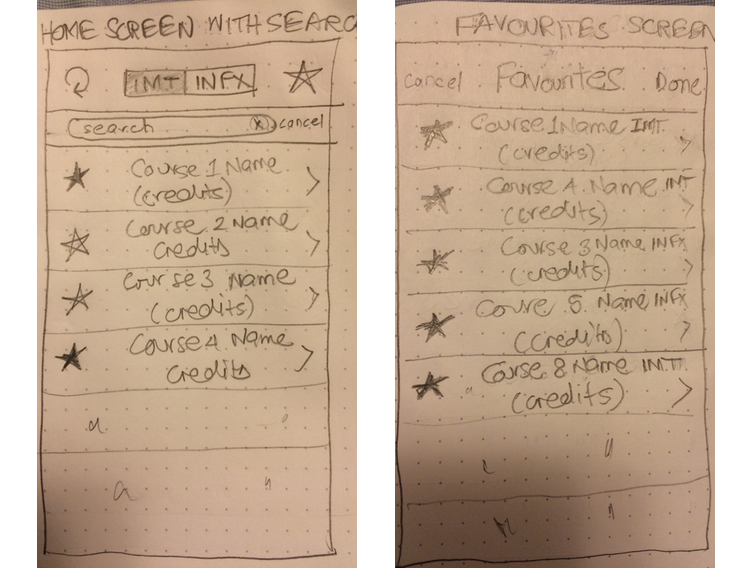
I built a paper prototype of the app that I envisioned. I tried to keep it simple and usable for a student so that it was easy to manage courses. I built four main prototype screens including the home screen, course detail screen, a favourites screen and a search screen as shown below.
I made the prototype such that the user would be taken directly to the course page as soon as the app is launched. The user can then easily switch to INFX type courses using the segmented control at the top. If the course content is updated by a school administrator, the user can simply tap the refresh button and get the the latest content directly on their phone. I also made it easy to favourite a course; just tapping the star near the course will highlight it and mark it as favourite.
To access all favourite courses, the user can tap the favourites button on the top right of the home screen and be taken to the favourites page. Here, the user can see all favourited courses, descriptions and number of credits. To search a course, the user can just pull down on the home screen and type in a course name or number.
Courses App
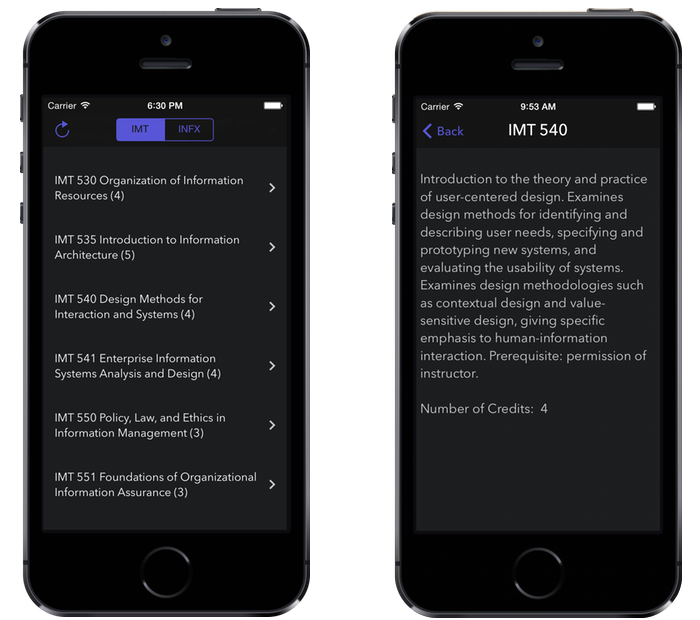
The app that I finally built is shown below. The app is still a work in progress and I need to add the search and favourites feature. For now, I use the app for quickly switching between IMT and INFX course types and reading course descriptions.
Design Considerations
I chose not to show the horizontal lines under each row in the home view because I felt it took away from the design. Also, the chevron at the end of each row gives the user an indication that it can be tapped.
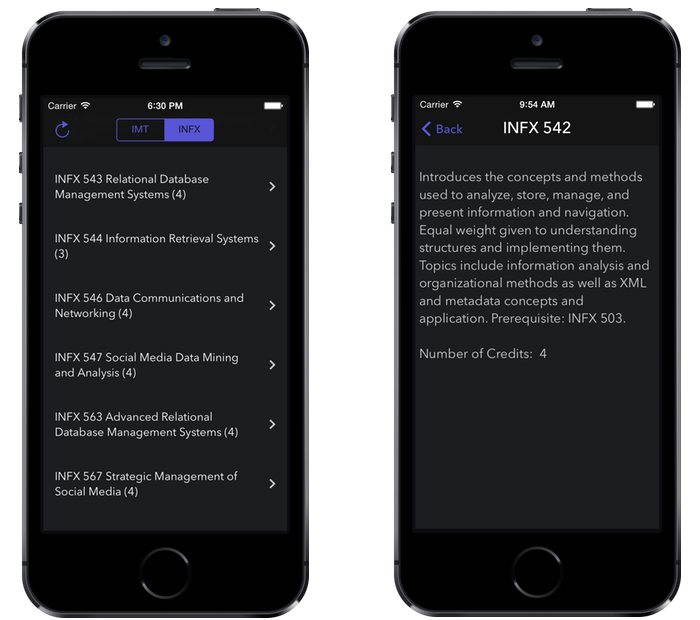
I showed some fellow students this app and requested them to test it. The feedback they gave me was that I should implement the favourites and search filter and also add a method by which users can view total number of credits. I'm currently working on adding this feature to the to the app.
Note: This app was created for personal use and is currently not available on the App Store.
